AccuWeather: Health & Activities
As of 2022, marketers report a 20% sales boost from personalized experiences, now a fundamental expectation for 70% of consumers.
In adherence to the terms of my confidentiality agreement, certain proprietary details have been excluded from the provided case study.
"Jonathan brings tremendous initiative to his projects, and is always eager to make a positive impact to both the business and users alike. While his 3 month stay as a UX Intern was brief, he helped standardize UX templates, and shape up experiences for high-profile projects. I highly recommend Jonathan to any organization who values an entrepreneurial team player with a passion for creating solutions that matter."
-Bradley Hebdon (UX Leader)
My Role
During my three month internship, I was part of a Design team of 11 individuals. I worked closely with three senior designers on the AccuWeather Now video feature and the Health & Activities page for both mobile application and desktop website.
My internship ended during the A/B testing phase for each of these projects as the designs were finalized.
The Challenge
The Countdown Starts, Now!
Upon joining AccuWeather's design team, I had the challenge to learn as much as I could and maximizing my impact within a three-month time-frame. My UX Leader gave me three main tasks;
1. Craft a comprehensive user experience for the AccuWeather Now video feature seamlessly integrated into the mobile application.
2. Enhance the user experience of the Health & Activities web page by implementing improved experiences and click rate to the design and functionality.
3. Develop a set of UX templates and standards to be utilized by the UX team in upcoming projects, promoting consistency and efficiency in the design process.
Navigating the intricacies of each project, which spanned across mobile (iOS & Android) platforms and their desktop/mobile website, presented a formidable challenge. Fast learning and effective time management were indispensable skills that enabled me to have meaningful work.
Learning the Service
Putting on My Reading Glasses
After spending several weeks at AccuWeather, my senior designer, who oversees my work, recommended that I embark on a personal project. This suggestion aimed to provide me the opportunity to take full responsibility for a project, incorporating 2-week sprint schedules to facilitate structured progress and ownership.
I decided to explore the design team's backlog to identify a project that was interesting yet not fully developed. I settled on the Health & Activities Page.
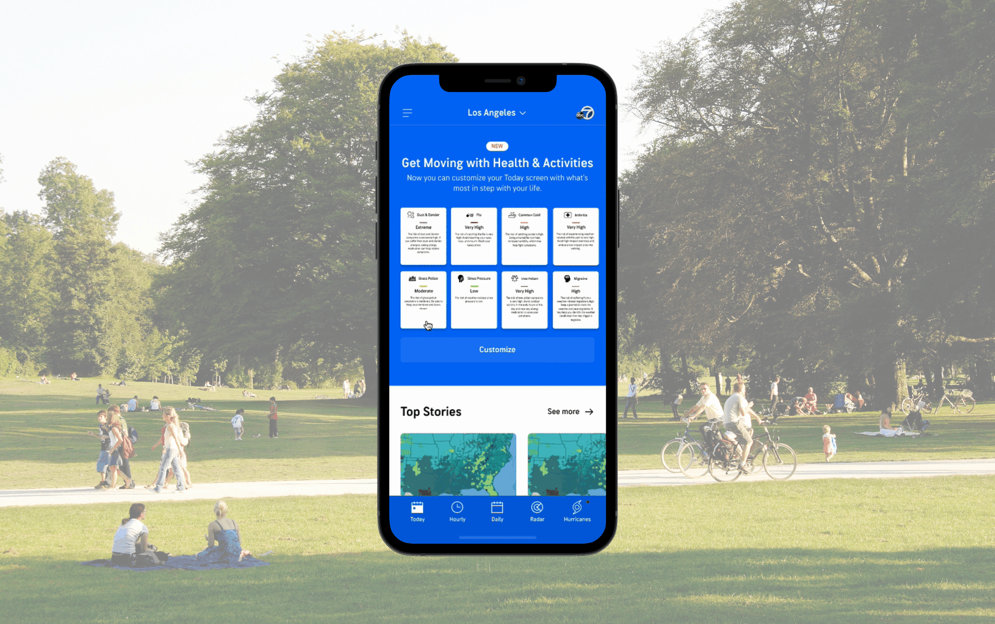
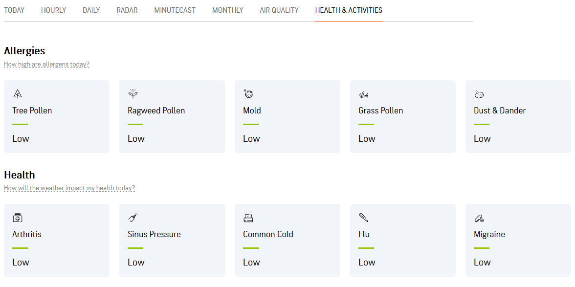
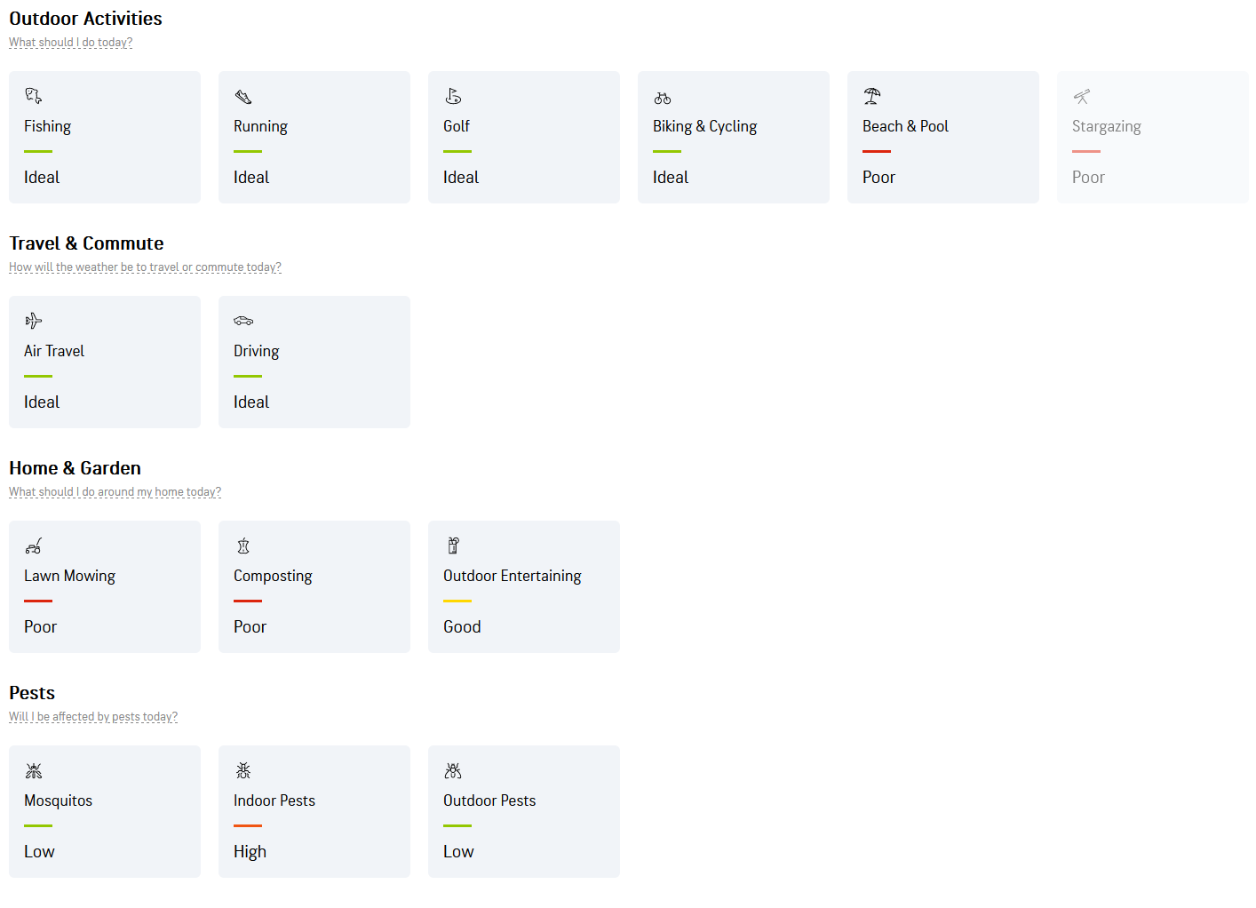
This Health & Activities page is seamlessly integrated across both the mobile and desktop platforms of AccuWeather. It showcases a diverse range of activities and health conditions impacted by the prevailing weather conditions.
Furthermore, clicking on a tile will bring up an informative graph. I aim to retain most of its features. This approach ensures that existing users will be able to grasp the changes with little to no relearning.
Though, as you can see, the page's original iteration is at a very basic. I wanted to enhancing the user experience by implementing improvements to provide a more engaging and informative platform.
Discovery
What's Happening Over There?
To guarantee that my designs would be both impactful and meaningful, I chose to undertake a series of analyses, ensuring to regularly consult with our team's data analyst for insights and guidance.
To maintain an empathetic design approach, I documented users' preferences for this new feature by jotting down quotes from their interviews. And I studied the user's path through the website to understand pain points and/or lack of engagement.
At this stage, I wanted an even closer look at what current users are familiar with. To achieve this, I've initiated a comprehensive market analysis of several competitors to understand how I can increase traffic on the Health & Activities page. I learned that marketers report a 20% sales boost from personalized experiences, now a fundamental expectation for 70% of consumers.

From my research, I decided to create three main changes to the page to encourage positive user interaction. Each of these proposed changes are based off of data points I received from our Data Analyst.
1. Improvement of the tiles so that variables are displayed clearly and uniformly.
2. Create a logical flow in the page so there is no scrolling to view hidden elements.
3. Create consistent variables on the graphs.
Designing The Tiles
I Am Grout
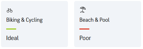
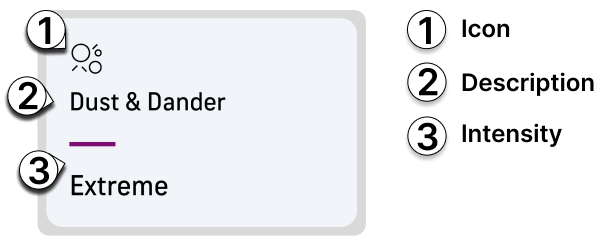
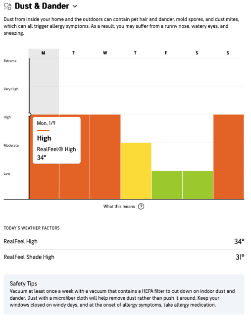
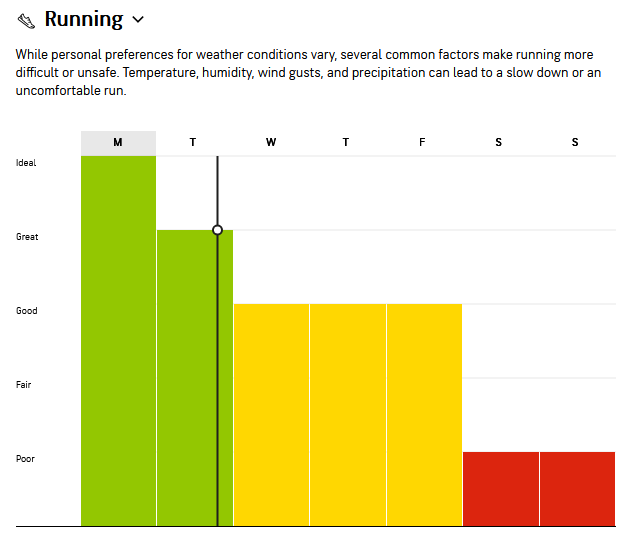
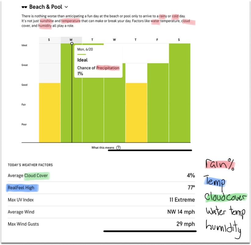
I am groot..After reviewing each of the tiles, I noticed that several variables are measured differently in the initial design. Some use scales ranging from low to extreme (good to bad weather), while others use scales from poor to ideal (conditions). This discrepancy (seen below) does not present itself until we view the graphs, and was confusing for many users, as highlighted by 27% of user interviews.
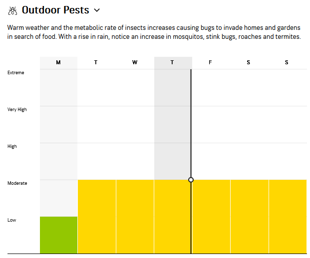
.
From this observation, I simply flipped the x & y axis from poor - ideal to ideal to poor. This approach aims to streamline the user experience and minimize confusion while maintaining consistency across all measurements.
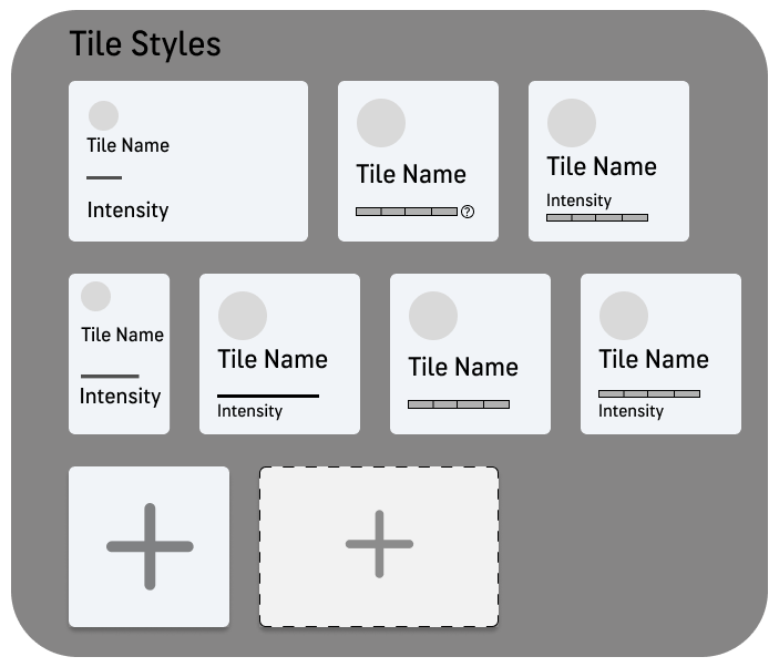
I then started to create different mock-ups of the tiles, intending to include a small bar graph at the bottom to signify the severity of the intensity at that time. However, ultimately, I decided not to go this route due to accessibility factors.
Surprisingly, this was not a dead end in my design process. The tile designs reminded me of a flashcard application I used in the past, where you could add or remove cards... this got me thinking.
Organizing the Page
Curator
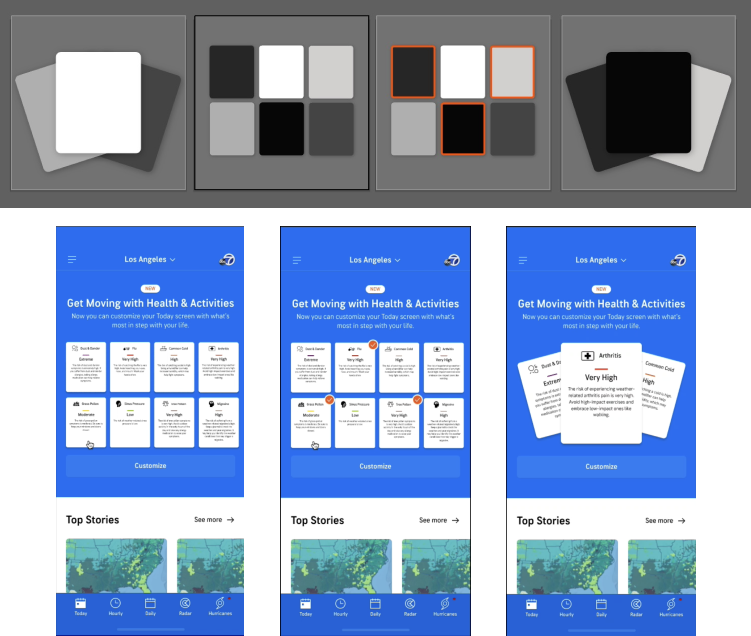
I wanted to make proper use of the tiles, by displaying them in a meaningful way. It is a shame to just toss them all over the page to overwhelm our users, so I was thinking how I could make the experience so good that people would want to stay longer than a few seconds and come back.
Why not give users their own accounts? That would give incentive to come back, customize, and be invested in AccuWeather's service.
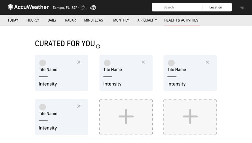
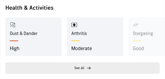
Above, you see a newly proposed Health & Activities Page. Four tiles will be auto suggested to the user based off of their location, weather, and various other factors.
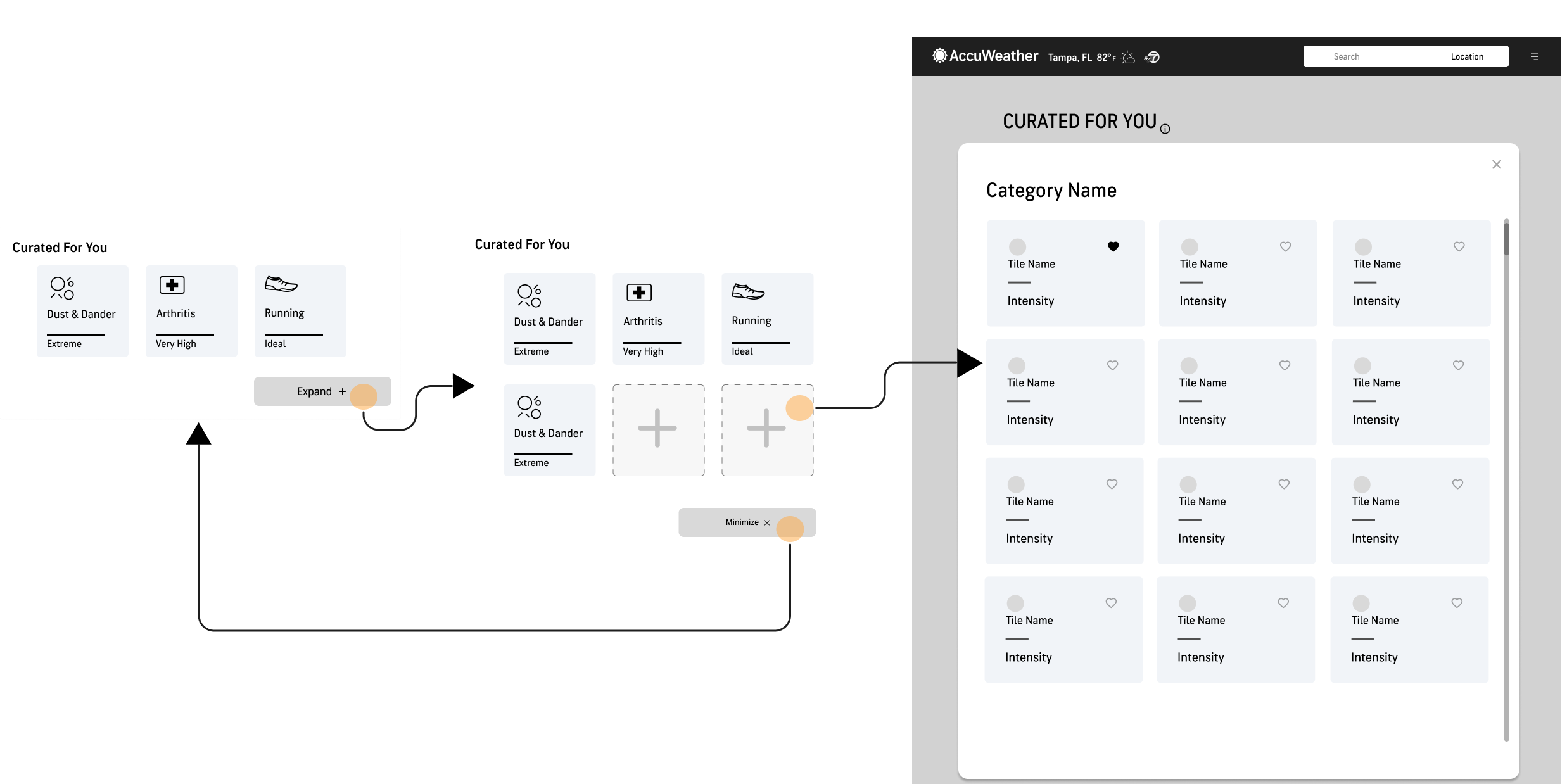
This would clearly display tiles that are relevant to users, have a logical flow, and display consistent variables for users to read through. As well as, encourage users to interact with AccuWeather's site and discover more features.
Reworking the Graphs
y=mx+plan b
As I mentioned earlier, I wanted each graph to have a uniform scale, so I switched the X and Y axes on one to achieve this. However, the more I looked into the user responses, I realized that around 18% of users were looking for more simplistic data on their activities. Many of these graphs would display five variables or more. So, I decided to create toggles for each variable, which would generate interactive graphs to tailor to each user's preferences.
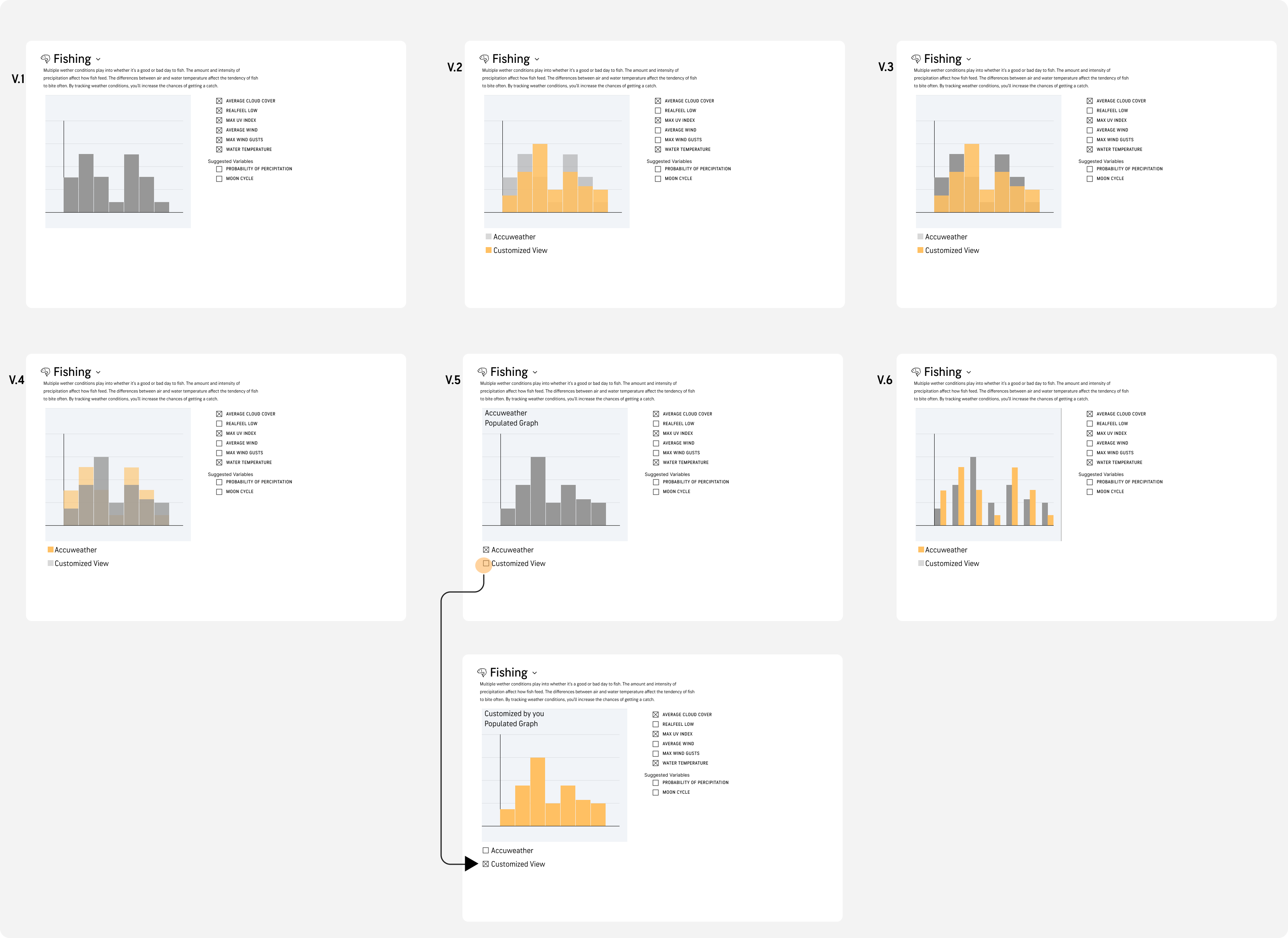
I created six different graph designs capable of displaying the desired variables
A senior designer asked me how we will ensure AccuWeather maintains its credibility.From her question, I developed double bar graph iterations. This allows users to compare and distinguish between AccuWeather predictions and their own alterations.
Hand-off & Reflections
That's A Wrap
Although my internship concluded before witnessing the project through its final stages, I was able to pass off to two of my senior designers that continue to add to this project. This project should be completed in the coming months in order to generate several new streams of revenue for AccuWeather.
Reflections :)
Looking back at my internship with AccuWeather, Designing with the team at AccuWeather was a genuine joy for me. The collaborative atmosphere, coupled with the guidance from the design lead, allowed me to immerse myself in the creative process without the distractions of company politics. I am sincerely grateful to, Bradley, the design lead for shielding me from such concerns and providing an environment that prioritized learning and meaningful design contributions over typical 'intern' projects.
What stood out most during my internship was the realization that I derived genuine satisfaction from both ends of the design spectrum. Understanding the intricacies of a specific project and comprehending its broader impact on the company became equally gratifying for me. This newfound appreciation for the holistic view of the design process is something I carry forward with me as a valuable insight gained during my time at AccuWeather.
• • •