AccuWeather Now
2022 was the year AccuWeather integrated a 24/7 live video feature to each of their platforms. A staggering consumer base of 1.5 billion individuals has been endowed with a comprehensive feature, designed to seamlessly address all their weather-related questions.
In adherence to the terms of my confidentiality agreement, certain proprietary details have been excluded from the provided case study.
"Jonathan brings tremendous initiative to his projects, and is always eager to make a positive impact to both the business and users alike. While his 3 month stay as a UX Intern was brief, he helped standardize UX templates, and shape up experiences for high-profile projects. I highly recommend Jonathan to any organization who values an entrepreneurial team player with a passion for creating solutions that matter."
-Bradley Hebdon (UX Leader)
My Role
During my three month internship, I was part of a Design team of 11 individuals. I worked closely with three senior designers on the AccuWeather Now video feature and the Health & Activities page for both mobile application and desktop website.
My internship ended during the A/B testing phase for each of these projects as the designs were finalized.
The Challenge
The Countdown Starts, Now!
Upon joining AccuWeather's design team, I had the challenge to learn as much as I could and maximizing my impact within a three-month time-frame. My UX Leader gave me three main tasks;
1. Craft a comprehensive user experience for the AccuWeather Now video feature seamlessly integrated into the mobile application.
2. Enhance the user experience of the Health & Activities web page by implementing improved experiences and click rate to the design and functionality.
3. Develop a set of UX templates and standards to be utilized by the UX team in upcoming projects, promoting consistency and efficiency in the design process.
Navigating the intricacies of each project, which spanned across mobile (iOS & Android) platforms and their desktop/mobile website, presented a formidable challenge. Fast learning and effective time management were indispensable skills that enabled me to have meaningful work.
Learning the Service
Putting on My Reading Glasses
Entering the agile environment characterized by two-week sprints, I integrated into the design team during the project's midpoint. Due to my arrival post the initiation phase encompassing the creation of user personas, surveys, and interviews, a substantial portion of my initial week was devoted to acquainting myself with the intricacies of the existing AccuWeather Now feature on their website.
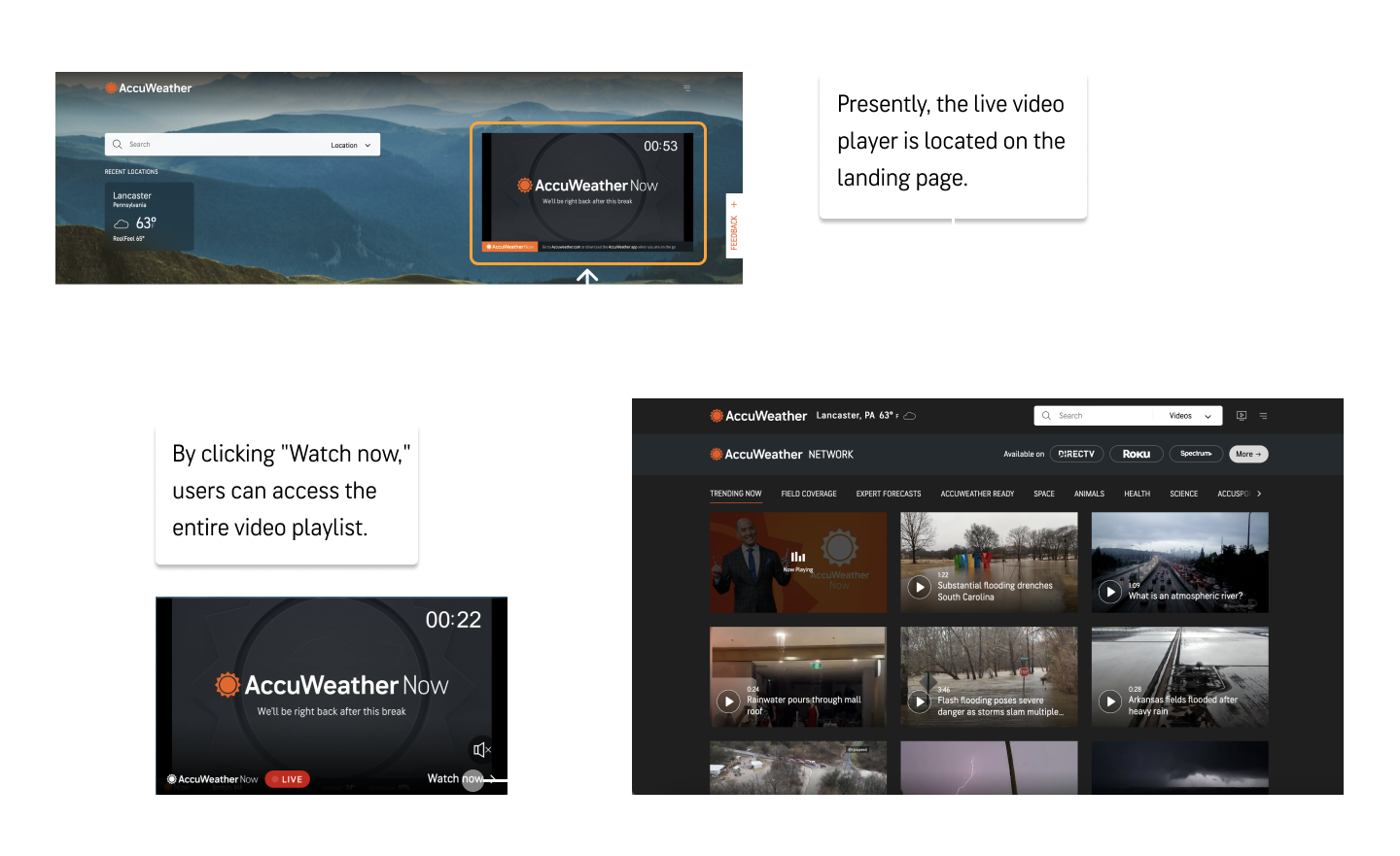
The web-version of AccuWeather Now, was at its initial stages. I found that it was a simple video player that would link users to a larger video wall. In-order to effectively create my own experiences I wanted to first look over the previously recorded user interviews.
I learned from the recorded user interviews that many of the pain points of the current AccuWeather Now video feature was its interaction rate. Many users did not want to interact with the video player even though it was on the landing page. Since the user arrived at the AccuWeather website for another task they found it more troublesome than helpful.
From this nice insight, I knew that I had to integrate a video feature so that it would not feel intrusive but desirable to interact with.
Discovery
What's Happening Over There?
To maintain an empathetic design approach, I documented users' preferences for this new feature by jotting down quotes from their interviews.
From this point I wanted an even closer look at what current users are familiar with, so I created a competitor analysis of seven of other companies that also use live video players on their platforms.
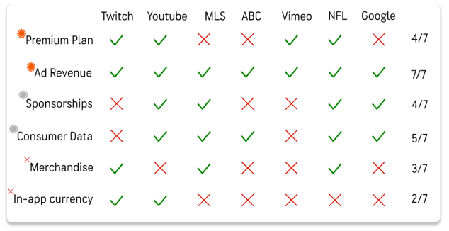
I not only wanted to understand the end-users but also business goals in-order to do so I started analyzing the different revenue models and features that the competitors use and hopefully identify potential opportunities for AccuWeather to establish innovative streams.
I uncovered six primary revenue streams and categorized each with a color logo, a gray logo, and an X to denote the streams in use, potential new streams, and unlikely options, respectively.
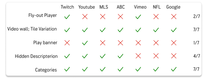
Next, I decided to take a look at some of the most popular video streaming applications to our targeted age ranges, from the existing user personas. Among these seven different application I found there were five standout features paired with video player features.
Design Framework
Pencil to Paper
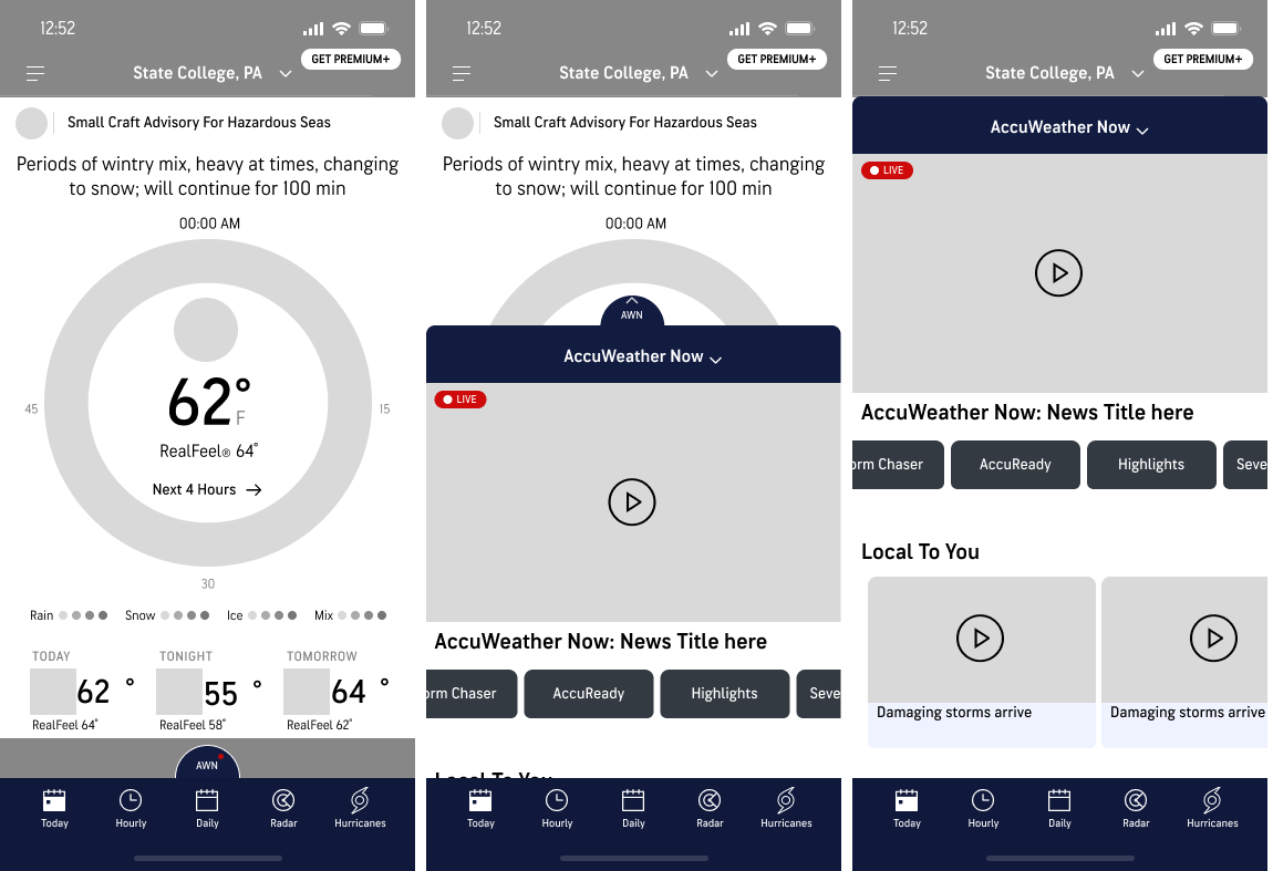
I wanted to create a design that aligns seamlessly with user feedback and our business objectives, emphasizing aspects such as accessibility, non-intrusiveness, the avoidance of obstructing ad banners, and the promotion of Call to Actions (CTAs), my initial design seamlessly integrated the fly-out player with the live video banner.
I opted to use these two features as one . Allowing the user to interact with the weather features in the application and give quick access to the video player to those interested in watching weather-related videos.
The bar design was thoughtfully derived from the bottom bar feature, with a deliberate focus on maintaining a non-intrusive aesthetic and encouraging CTAs as users explore the newly integrated feature.
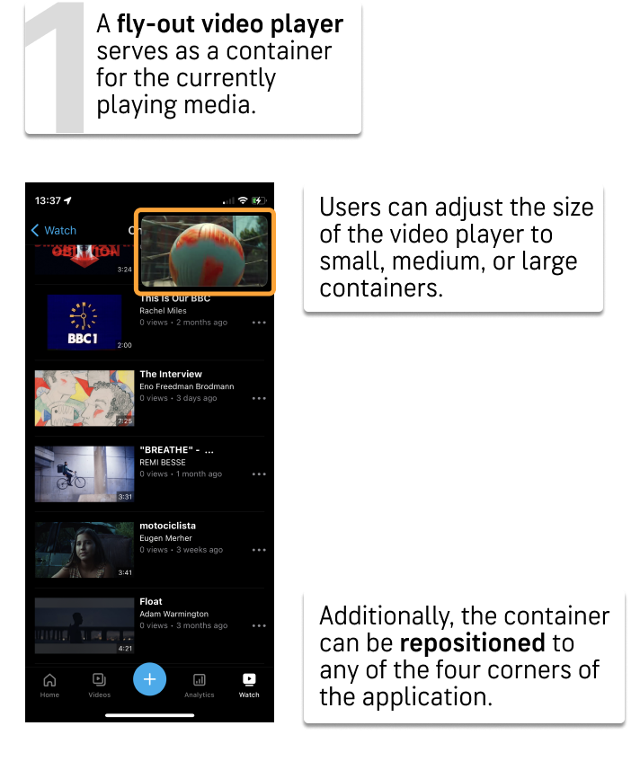
Positioned at the bottom of the screen with a subtle hover effect, the bar ensures easy visibility and draws attention in a discreet manner. Upon tapping the banner, it seamlessly expands into a fly-out video player, complete with intuitive buttons for play/pause, mute, and minimize.
The flexibility to resize and relocate the fly-out provides users the freedom to explore other aspects of the app without the video obstructing specific elements.
Some Quick Feedback
Adjustments To Be Made
During one of our feedback sessions, a senior designer pointed out a crucial flaw in my design. The floating banner was obstructing an ad banner, rendering the functionality of the fly-out player impractical.
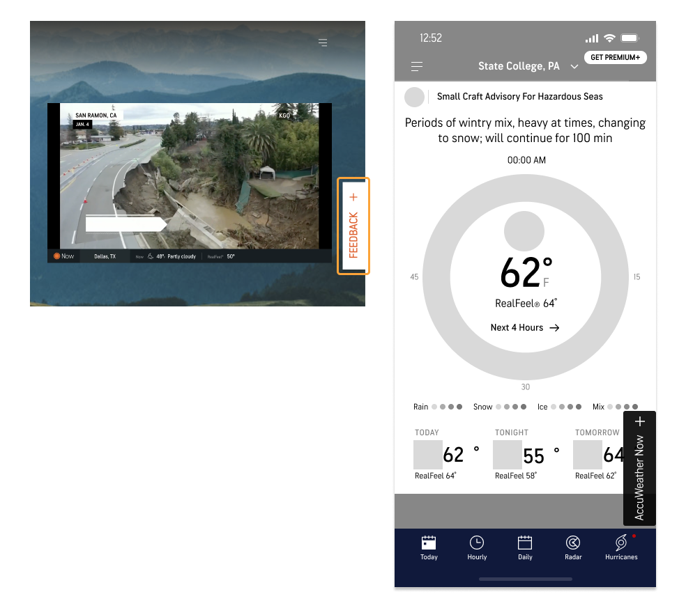
I tried my best to salvage this particular design since it was among my first. I looked at the live AccuWeather website and found a floating feedback bar. I tried to adapt it to my design but found it obstructed graphics in the application to I had to find a different solution.
Design Framework
Musical Defeat?
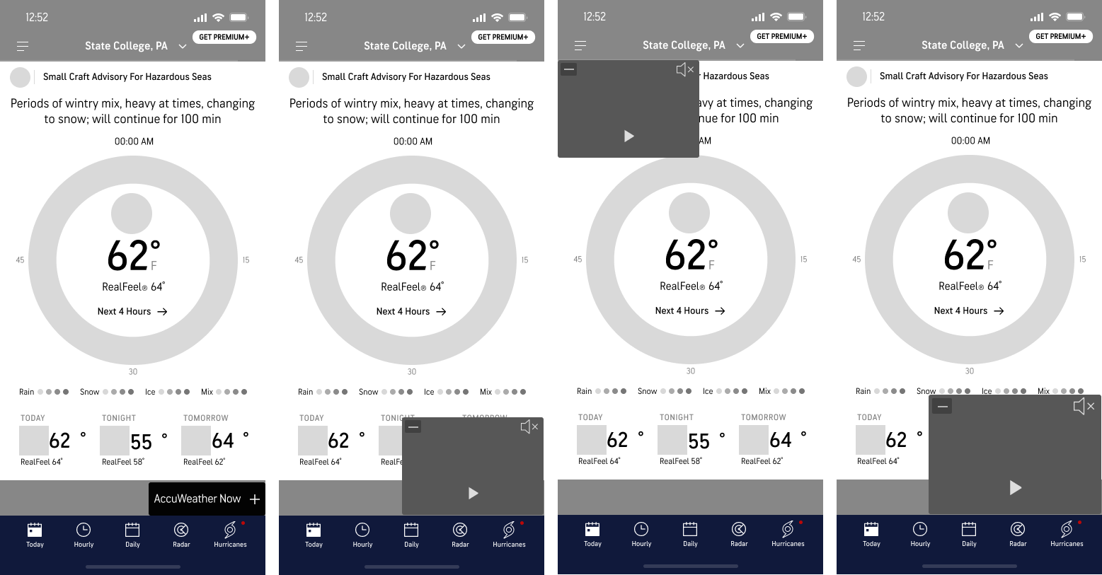
After that meeting I felt as if I had to start from square one all over again. So I decided to turn on my music and get back to the design process. But I noticed something amazing as I navigated my music player. It was just what I needed. Most if not all of our target users are familiar with streaming music applications, so adding a feature that is similar would keep our AccuWeather application intuitive.
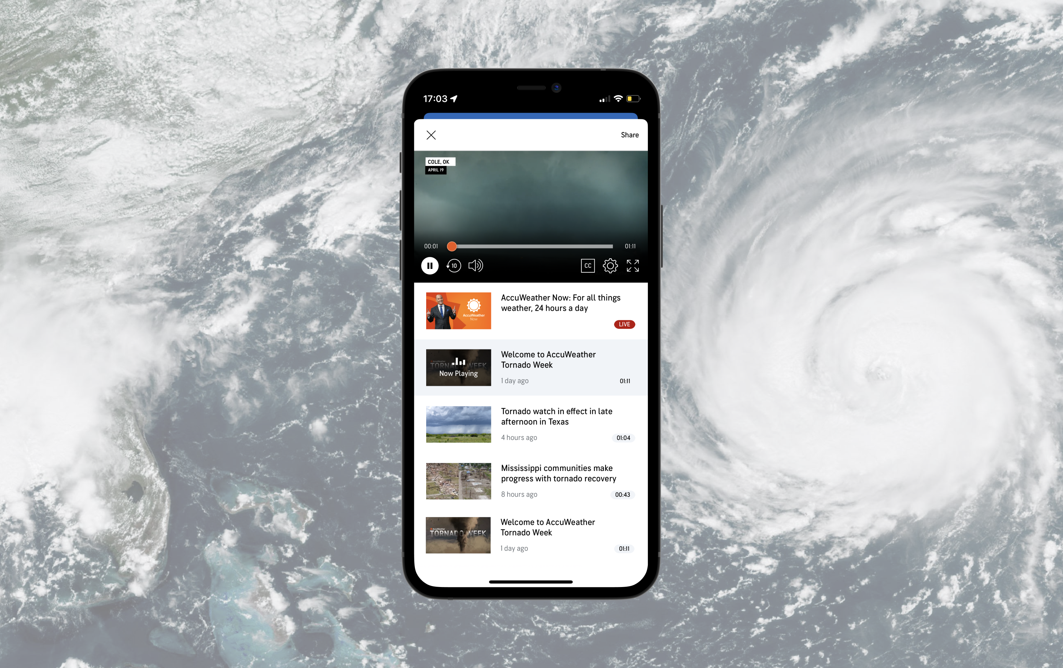
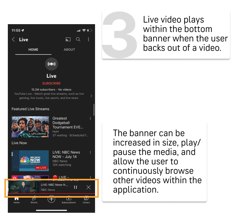
At the upper part of the bottom toolbar, there is a half-circle featuring a notification indicator in the form of a red dot. This deliberate design prompts user interaction and curiosity. Tapping or swiping this semi-circle causes a video window to emerge, providing an engaging and intuitive way for users to access video content.
Considering both user and business objectives, the semi-circle design serves a dual purpose, ensuring the accessibility and non-intrusiveness of the video feature. The incorporated notification indicator stimulates user curiosity, encouraging exploration of this feature in an intuitive manner. In response to previous feedback sessions, particular attention was given to avoid obscuring any ad banners present in the live application, aligning the design with practical considerations and user experience optimization.
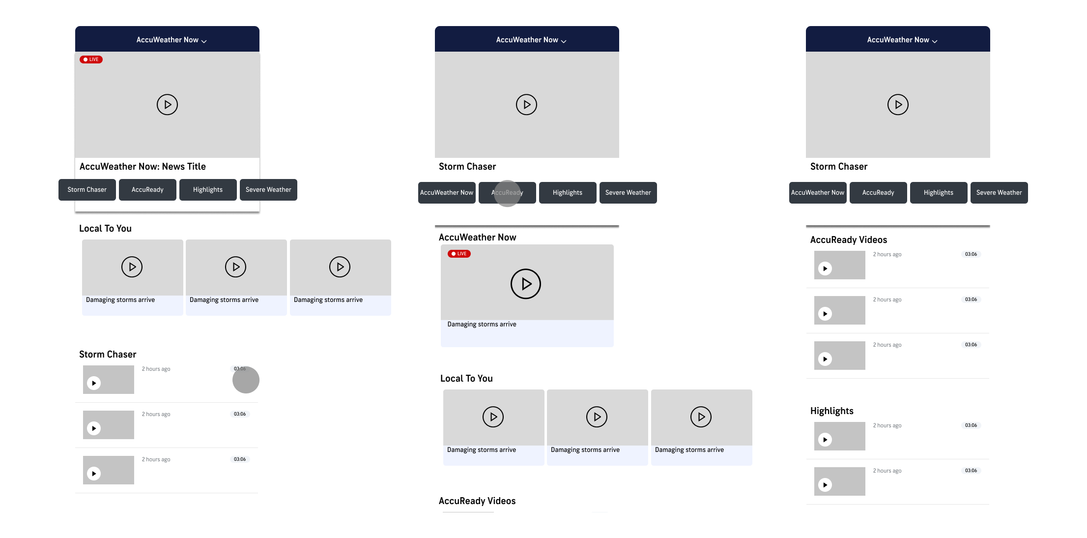
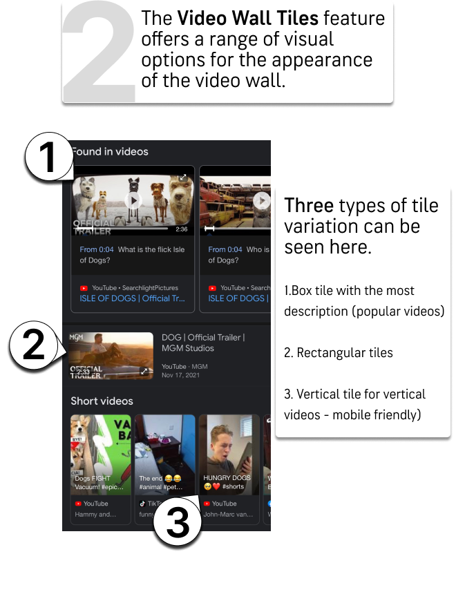
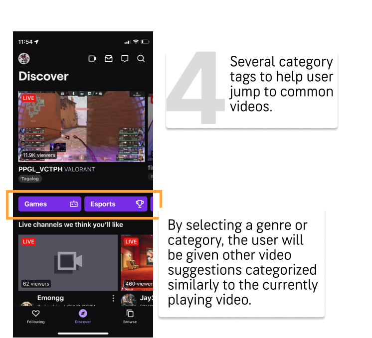
The user flow chart above illustrates the seamless process of switching between various videos by simply tapping on the desired selection. In the second figure, I introduced category tags inspired by my previous competitor research. This strategic addition aims to bring order to the potentially chaotic video overview page and assist users in locating specific types of videos, even when they may not know the exact name to search.
What We See Now
Times Up
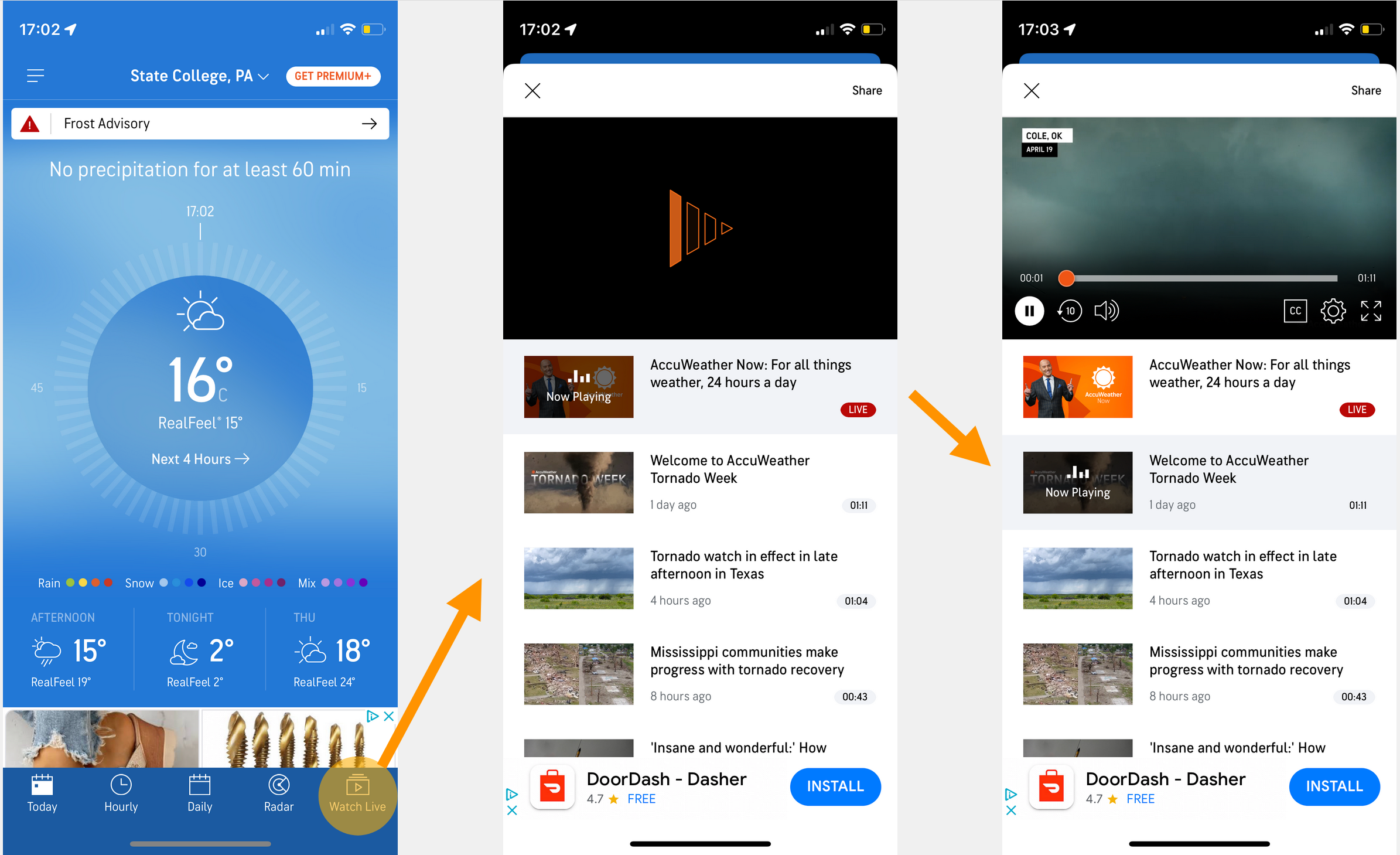
Although my internship concluded before witnessing the project through its final stages, I was delighted to encounter the implemented feature approximately a month later.
While I observed slight alterations to some of the designs, I am beyond happen to still see my tray design present! Notably, I took the initiative to calculate the potential ad revenue, factoring in previous metrics, projected growth, and the number of click-rates from both new and existing users. The conservative estimate revealed a promising 39% potential increase in ad revenue attributed to the incorporation of this video feature.
Reflections
Is The Really The End?
Looking back at my internship with AccuWeather, Designing with the team at AccuWeather was a genuine joy for me. The collaborative atmosphere, coupled with the guidance from the design lead, allowed me to immerse myself in the creative process without the distractions of company politics. I am sincerely grateful to, Bradley, the design lead for shielding me from such concerns and providing an environment that prioritized learning and meaningful design contributions over typical 'intern' projects.
On the flip side, one aspect that posed a challenge was navigating around the dated design constraints imposed by ads. Despite my efforts in competitor and revenue analysis, I found it challenging to discuss potential improvements with the relevant stakeholders. However, this experience taught me the importance of communication and advocacy in bringing about design enhancements, even in areas as sensitive as ad integration.
What stood out most during my internship was the realization that I derived genuine satisfaction from both ends of the design spectrum. Understanding the intricacies of a specific project and comprehending its broader impact on the company became equally gratifying for me. This newfound appreciation for the holistic view of the design process is something I carry forward with me as a valuable insight gained during my time at AccuWeather.
• • •